How did these clowns manage to make my mouse cursor laggy? It is incomprehensible for me to live in such a big bubble with such a big paycheck and then spend zero brainpower on systems without graphics acceleration.
This is extremely bad engineering and these engineers should be called out for it. It takes a special kind of person to deliver this and be proud of it.
Once they made their millions at Google these engineers will be our landlords, angel investors, you name it. The level of ignorance is unfathomable. Very sad.
The expressed goal is emotionally impacting UX. They clearly got strong emotions out of you. Mission accomplished!
Couldn't agree more. It's basically a page with some pictures in it, and everything in it loaded so late for me that initially I wondered why they left so many large empty spaces in the page.
This could work and be fast with tech from at least 20 years ago, probably even more. It's really incredible this is output from a company valued in trillions.
Indeed. Google is the worst at designing around lazy loading. Their UIs in Drive, Youtube Music, and others essentially become unusable once the list gets long. God forbid you don't have a super low latency connection straight to the data center. Even holding open a web socket to fetch "next pages" doesn't cut it in most of the real world. If you're gonna lazy load (which I admit sometimes does make sense) you need to aggressively fetch the next page. If I have 200 files in my Google Drive and they're sorted alphabetically, and I want one that starts with "y", the UX is so unbelievable bad that I sometimes wonder if I'm being pranked. I'll have to wait through a dozen "next page" loads that only load a screen worth of files at a time, and each pause makes me wait a second or two. That really adds up when I just want to scroll to the file. Scrolling through large playlists in Youtube Music is utterly painful nowadays too.
Please people, test your UI on low bandwidth connections, high latency connections, and both conditions together. It doesn't need to be perfect, but it doesn't have to be anywhere near this bad. HN performs way, way better than these modern javascript heavy lazy loading apps, and I think there's some important insights in that sitting right there for the taking.
Scrolling back in google chat is another horrendous experience. Trying to see a message you sent last week? Scrolling up is like “here’s 5 messages”… “here’s 4 messages”… “here’s another 5”. It’s like a college student wrote it.
Especially when metadata is so cheap to send over. Even if you have literally thousands of files, there's no reason why they couldn't send it all in a single JSON at first page load. Gzipped it would be nothing.
The crazy thing is, theyve written one of the best guides on the internet on how to do an infinite scrolling list: https://developer.chrome.com/blog/infinite-scroller
They also seemingly went out of their way to prevent ctrl/cmd+click on several anchor elements in pages like https://m3.material.io/components.
Arrreg!! So many of these React (et al) sites, with poorly re-built elements and break the built-in functionality! The A tag works perfect! But no, we need three or four nested divs, components, and many lines of JS to end up with something worse.
Is React the driver? Do devs just not know? Is management pushing garbage?
> Is React the driver? Do devs just not know? Is management pushing garbage?
I'd say developers who aren't web developers trying to do web dev seems to be the cause of this. Understanding the platform you're developing for is pretty much table stakes for any developer, and not understanding when to use <a> is pretty much the most basic mistake you can make. Literally the first things you learn in web development is about linking to other pages, yet somehow still people fuck up putting a <a> into a webpage properly. Boggles my mind.
React makes it as easy as any other library/framework, but if you don't think about what ends up in the DOM, and why certain things have to be a specific way (often for accessibility and user experience), then you'll screw up even big and expensive projects like this apparently. 2x boggling since this project is literally all about user experience yet they get the most fundamental part of the web wrong.
If you render an <a> in React (or Angular, which I think they're using here), it's just an <a>! You have to do extra work to fuck it up!
I'll generally excuse things like laziness and incompetence, because I understand that not everyone is good at their jobs.
But this:
> You have to do extra work to fuck it up!
resonates so hard. I get so angry at people who take extra time out of their day to put so much effort into making things worse. So many things on the internet are fine, but people spend so much on making them worse. Who is this good for? Not me, and likely not the person who wasted their time ruining functional things.
This website is awful. It is extremely sluggish, laggy, and annoying. On top of that, I had to wait a significant amount of time for it to load. No thanks. I thought the tab is going to be killed...
The "beauty" of websites built solely with javascript.
As if they couldn't build an absolutely identical page with just HTML and CSS. But no, javascript is the way for them because it has way more tracking and fingerprinting abilities than plain HTML and CSS.
Probably because they seem to be recreating the cursor on the webpage for that cool effect. Even on a good computer I have some input lag, and going from very low input lag and 120fps cursor to that it feels slightly off. Although I might be imagining it just because it looks different than the normal one...
Browser don't support replacing cursor images natively for obvious reasons. You have to use JavaScript for that.
CSS supports replacing cursor images natively.
In this case it looks like they didn't just want an image though, they wanted the cursor to invert the color of whatever part of the web page it's over, and to seamlessly morph into a selection highlight whenever you mouse over certain controls. Seems like that's a lot harder to make performant.
The only obvious reason I can think of is security concerns (some sort of user confusion), but JS wouldn't help with that. What other reasons are there?
> How did these clowns manage to make my mouse cursor laggy?
The lag and that cursor makes it feel like trying to type with mittens on.
OMG I thought it was something wrong on my end, privacy add-on or whatnot. Glad to see they just lost it.
> The level of ignorance is unfathomable. Very sad.
This to me reads as an indictment of your own lack of effort to tackle these problems for yourself. As if sudden realization of how codependent you are set in.
Your paranoia over them controlling your life is bizarre since you have to agency to walk away and go make clothes, copy paste together existing libraries for mouse input. Physics doesn’t oblige you to sit there being useless to yourself. There’s no Ethernet cable up our ass. Taking away their power is a mere act of agency to increase the difficulty of communicating at us.
Your level of ignorance is unfathomable. Very sad.
I have an 8 core CPU and a 10 TFLOP GPU and the cursor on this site lags in Firefox but is noticeable smoother in Edge.
One of the good things that came out of COVID was Google Docs suddenly getting a whole lot better. Why? Because Google engineers finally had to use their tools like the rest of us do, and found out very quickly that Google Docs on normal consumer internet connections sucked.
Google as a company, and in many ways Silicon Valley as a whole, is designed around being a bubble that is ignorant of how the rest of the world actually functions.
Pretty sure Google has used Docs internally since long before COVID.
"used Docs internally" is not the same as:
> on normal consumer internet connections
Oh yeah. One of my pet peeves is that every comms product from Google (say Google Meet) works poorly on a slow internet connection, and slow could be something not bad at all, say 20 Mbps. Zoom, the former Skype, Slack Huddles, Go2Meeting, absolutely every other product has good audio quality and tolerable video quality. With Google products there are dropouts every few seconds so you can't understand what the other people are saying.
I have used Google meet exclusively for a number of years, multiple times a day on the cheapest Internet connection I can buy in my area. It is consistently a better experience then Zoom or Teams.
The only caveat is that the experience is not good on Firefox. Google meet is the only thing I use Chrome/Brave for.
Not just the technical aspect here. I read through the page and nothing of any measurable importance was stated. What problems did this solve? What benefits does this bring to users? I guess I was expecting more from Google. The initial Material design system made some good points and addressed some issues for UI design. This just seems unfocused.
You are just part of the problem. In which companies do engineers still have the final say? Almost none.
It's because the developers have extremely fast and graphics accelerated hardware. I can't notice any lag whatsoever on the mouse cursor on my M2 Pro but.. But a lot of folks won't have top end HW.
I have no cursor lag and I'm on a 2019 Intel MBP.
Why does everything reek of late capitalism? Even design doesn't fail to emanate a distinct "dystopian megacorp" stench.
[Ticket Closed] resolution: user should buy a macbook pro with at least the M3 processor
/s
The web pages are working properly on my 5-6 year old laptop running Ubuntu and Chrome. Maybe it doesn't work in Safari or on Macs?
SecOps put CrowdStrike's Falcon and Windows Defender on our Macs so we'd have about 20% CPU left for our actual dev work. That's not an exaggeration, staring at the System Monitor is all you can do when everything is locked up.
The Android emulator sucks the remainder with ease. The app performs better on a low end Android burner phone then our dev machines so at least we know our users are having a reasonable experience.
You just triggered some PTSD... years ago I had to send my CTO a recording of my screen with keyboard input lag on VSCode because CrowdStrike was eating up all my CPU.
I asked him if it was a good use of my (expensive) time to wait 30 seconds for characters to appear on my code editor.
Luckily he gave me a "special exemption" that allowed me to shut that monstrosity down !
I had a couple of customers that deployed 7 endpoint security tools of the "hook into processes and inspect everything" variety. The exact mix was customer-specific, but if you're wondering what that looks like:
* Stand-alone "best of breed" endpoint DLP
* Stand-alone "best of breed" EDR
* Process whitelisting tool
* NAC posture assessment agent
* Three different AV agents
This is not even counting their VPN client(s) or the third party disk encryption agent they used.
I marveled at how they even got all of the agents to coexist, let alone have enough CPU left for people to do their jobs.
The update to Android 15 was TERRIBLE. I updated it the past days, it's literally a bootleg copy of iOS interface. I despise it so much, much more than the move from Material Design to Material You. Everything occupies so much space, there is less information available for you, and important things like changing the music in your lock screen is confined to a tiny space.
At least they got the Expressive right in the name now, Material Expressive (HATE).
Every update is worse than the last. I did the same, and I'm particularly loving turning bluetooth on or off requiring a swipe and three button presses instead of one. And I thought the quick settings regressed in 14 when they went from icons to huge buttons, but now they've gone for less-huge buttons with always-truncated text in.
At least with Windows it alternately gets much worse then a bit better again with each version.
Regarding the monstrosity in the link, yes it does make me 'feel things' - things I will refrain from typing out lest they be construed as threatening behaviour.
You can say a lot about Android 15, but I have a Pixel and an iPhone 16 Pro and they do not look alike... at all? Pull down the notifications and quick settings, it does not look remotely like iOS. The same for all the native apps.
I wonder if you have Samsung One UI 7 or some other skin. One UI 7 looks a lot more like iOS, but there is little Google can do about that?
> How did these clowns manage to make my mouse cursor laggy?
FWIW, the link is to basically a glorified demo page _of the design_ of material 3, not a real world implementation of that design. So, that page's performance is not at all reflective of what you'd see when using a relatively recent android app that uses flutter's material components (https://docs.flutter.dev/ui/widgets/material) or one of the many web component libraries that implement MD.
The lag you're noticing is also likely entirely due to their weird cursor behavior. If they simply removed that, I suspect the page's performance wouldn't be at all noticeable.
If the people who came up with this design can not make the demo site performant, site which will be the first impression of your new design language for most, I don't think there is much hope for the rest of us.
But since this has name of Google attached to it, many people will mindless ape it to the detriment of experience of their users.
This page is a promo page of the ux design language people as created by UXD/UXE role people.
It's basically like looking at a Figma export and complaining about the performance of it; any actual implementation would be done for any user-facing products realistically will be entirely unrelated both technologically and organizationally.
I think the people who implement google's html/js/css for random articles aren't particularly connected to engineers working on android/flutter widget performance, and the MUI developers aren't even google employees (mui/flutter being the main implementations of MD AIUI). I'm not at all concerned.
Before I got an iOS phone I thought "why do people care about apps?" I mean, there is an app to get me into my gym but with my Android device it would take about 45 seconds to open so I might as well just give them my phone number. It was always faster to go to a web site or go to the public library or do anything other than wait for an app to open.
Every Material UI library I've seen in existence is a bloated wreck full of bugs. The Angular MUI "flagship" has the worst performance I've ever seen of basic things browsers have supported for decades and CSS does very well for like buttons. Some MUI teams find ways to bring all of Angular's bloat to everywhere else, the React library is awful. I've had to use MudBlazor, the attempt to do MUI things in Blazor, and it is truly awful. Maybe Flutter is an exception, congratulations to Flutter I guess.
This wouldn't be so much of a problem if so many corporations also hadn't somehow decided that MUI was the next Bootstrap and have been treating it as an underlayer in their Design Systems, most of which aren't actually supposed to look like Material and don't really benefit from being huge additional libraries of CSS and components on top of MUI. I blame Figma for this. I don't know that it is any one specific thing Figma is intentionally doing, but the more design teams use Figma the more they seem to think they "need" a safety blanket of Material UI somewhere in the design stack that they won't actually use correctly or well.
As an engineer often tasked with performance work, I hate how much of Material UI's braindead approach to performance reflects on me in ways I can't do anything about "because that is the design system you wanted" (not the design system you needed). I wish Material UI would either get significantly better or just die already.
I tend to agree with your criticisms. FWIW, I do think mui has peaked, at least for greenfield projects. A new wave of tailwind-based libraries are rising fast, the most prominent of which are Mantine and Shadcn. IME, both perform MUCH MUCH better than mui.
Wow, in the process of making the send button slightly easier to find, they reduced the amount of actual content in the screen by a couple lines. And they still overlay controls on the content, thus obscuring some of it, just like earlier versions of Material Design.
The prettier and more fun modern UIs get, the more I miss the UIs of the nineties. Controls looked like controls, screen space was well utilized, and even workflows that weren’t the most common were generally well supported.
<sarcasm>I suppose if an LLM writes your email for you, you don’t actually need to see all the text yourself.</sarcasm>
Oh my god, this is ugly as fuck.
It reminds me a study about the perception of beauty among students of arts.
Before they start their studies, their perception of beauty is similar to everyone's.
But as they go through their course, their perception starts to shift. What they see as "beautiful" doesn't match the perception of others.
They learn what "skeuomorphism" is, and suddenly everything must be flat and undifferentiated.
I think it's actually less flat, with more affordances (though not quite skeuomorphic).
Basically "oops we made it too flat, let's make those buttons big and colourful so people can see them again". It's a step forward after two steps back.
tbf, mature tastes are often different. it's not good or bad, it's just different. for example, people who drink a lot of old red wines have developed a taste for it.
yes, it drags people away from the mean, but that doesn't stop large segments of the population from acquiring certain tastes (e.g. coffee).
as a long-time user of tech devices, your tastes too have been dragged in certain ways, even if you couch yourself as an average user.
fwiw. i love android, but I do not really care for their current design direction.
(by the way, you might want to look up skeumorphism. material isn't skeumorphic, almost by intention.
Material Design v1 cracked it. It was simple to implement, simple to understand and simple to use. Minimal overheads with a clear content-first approach.
"It's time to move beyond “clean” and “boring” designs to create interfaces that connect with people on an emotional level."
I don't want websites and apps to connect with me on an emotional level. I want to turn my phone/computer on, use the app/program to achieve what I'm trying to do, and turn it off again, so I can get back to the real world.
> I don't want websites and apps to connect with me on an emotional level. I want to turn my phone/computer on, use the app/program to achieve what I'm trying to do, and turn it off again
Building a B2B SaaS app one of the most refreshing thoughts I've had about it was: "people don't like using my app". The software I'm building nobody wants to use, but they have to use it for their work.
Given that I try my hardest to make the app as efficient and as fast as possible so that people can go in, do their thing, and get out. With things like design's I'm very careful to preserve the button layouts of all the UI's because I know my customers have largely memorized where they are.
I could see adding some "flare" like this in lower touch points in my app but I would not do this for high touch points. Those places need to be fast and predictable, a customer won't look too kindly on any redesign if they now have to spend an extra second or two looking for an action or waiting on an animation.
In terms of MaterialUI though, my app actually uses M2 (via the React MUI lib) and I'm pretty happy with it. I wish like hell Google would finish their M3 web implementation so I could hop on that instead of using a 3rd party lib but it seems Google has gotten M3 to where they personally want it and just kinda abandoned development.
My best experience with job-related software was a data entry program (I forgot the name). It had a windows classic UI (on windows 8) and fully keyboard driven. After a few days, I could just look at the paper form and enter the data without looking at the screen. Very usable on a 11inch screen.
These days, I mostly reverted to a Emacs/TUI workflow. Padding and animations makes everything less usable.
You're talking like Google isn't a ad company trying to keep you staring on your screen.
No see "today, people increasingly see their devices not as tools, but as extensions of themselves."
We are merely catering to those needs. It is philanthropy really. A kindness.
/s
I had the same reaction when they said that "younger study participants had the most enthusiastic preference for M3 Expressive." Could it be that young people are most likely to be impressed by pretty bullshit, and the whole point of this redesign is futile?
They managed to connect me to an emotional level that I just want to throw my phone away and get a phone that supports postmarketOS. I despise the new designs so much, they are so useless and try to take away important information on the screen for absolutely no reason. While making everything round and trying so hard to copy iOS, but making a shitty job at it.
But … that way phones would get obsolete much faster, and so you’d be able to buy an obsolete sluggish Pixel of two years old, and install something different on it! Like Lineage, Graphene, Postmarket.
It's effectively designing to maximize attention retention, or however you want to call it. Keep the eyes at your product for as many seconds as possible, to increase profit.
I mean... to make a dElIghtFul eXpEriEncE.
I must be going through some mental changes nowadays. I just want my computers and software to get their job done and go back to the real world as soon as possible. I feel sad about all the time I lost staring at screens growing up. I wonder if this will be widespread opinion someday.
The quicker the phone is back in the pocket, or the computer is turned off again after using it for something (that it does better than I can) the better.
I'm going through the same thing. Grew up dreaming of having a pocket computer. Nowadays you can basically live your entire life on the internet, as others are doing the same; people (think they) get their social needs met, buy food, do their work, find partners, anything. And it seems like a big part of the younger crowd wants (?) this trend to continue.
I don't want to speak for you, but I think there's a big crowd that's unique here: we have one foot in the "old world" and got to experience that, and now we see the "new world".
If you grow up with basically a phone in your hand, and you see how big a part of your life it is, I think you're way more inclined to appreciate these changes. After all, their phone is an extension of who they are, it's part of the whole picture, the outfit.
Thanks for writing this. It's refreshing to see there's a bunch of us in the same boat.
I think you've hit the nail on the head about the two worlds. My phone sits in my pocket most of the day and just comes out when I need it. Every day I see people looking at their phone as they walk through busy streets, walk their dog, pushing prams, at the gym on the treadmills, bikes and on the machines. Especially jarring to see when it's a rarish sunny day and all that changes is the brightness setting on their phone.
Yeah, my phone is just an accessory I keep in my pocket, but only when I know I may need it for something, e.g. time or calls. Sometimes I do not even take it with myself. No reason for me to do that. I just hit 30.
I feel you guys, but do you read and write here from your laptops? I never come here from a desktop browser, only a smartphone.
It's good for you. It's not good for them ("them" being the people that make Scrooge McDuck amounts of money for keeping you staring at ads).
They have to pretend you want emotional designs. Because how would they keep their jobs? Every iteration of material design needs some bullshit improvement.
> Material Design v1 cracked it.
And yet they had to have a study with 600 people to tell them that ... text fields have to look like txt fields. And they still failed to make textfields look like textfields
That's a mixed bag.
Have a look at the linked https://m3.material.io/blog/building-with-m3-expressive to get a better impression of what this is about. From the guidelines given there, many parts of the design make sense and will help designs work better - grouping objects properly, be aware of contrast to highlight important elements, more options for good typography (instead of basically none, Android/Material offered nothing by default), helpers for highlighting buttons etc. It's also still simply a good idea to focus on good animations that actually work for the UI, instead of being superfluous baggage, and then to make them feel nice. I'm not saying it's groundbreaking, but it's helpful to have something like this as an official guideline, and be it to reign in rogue designers.
But it's still a flat design, and thus does not properly transport clickability. And their weird approach for the color schemes still leads to an ugly mess, pastel with weird contrasts and color combinations that just are ugly. I haven't seen a proper analysis what's going on there, but it sucks. Also, this whole design system is very far from leading to a consistent system, but that seems to be a non-goal, just some standard component building blocks are there to foster familiarity.
Better than nothing and probably a step up, but M3E doesn't convince me totally so far.
> But it's still a flat design, and thus does not properly transport clickability.
And toggled / disabled states. With mobile’s lack of hover, it’s often a game of trial and error to figure out what’s even interactable.
> And their weird approach for the color schemes still leads to an ugly mess, pastel with weird contrasts and color combinations that just are ugly.
It looks like a poster for a party. To extrapolate, it feels like the lineage is digital marketing, especially video centric content on mobile-exclusive byte sized attention-scape. This style draws less attention to your options (what you can do), and more towards content (what’s provided for you). It’s reduced decision making, highlighting the happy/desired path even more. No wonder it scores higher in user testing - it requires less thinking IF you take the happy path.
I’d imagine it works great for simple commercial products with single call to actions. But for apps (not posters) it leaves a lot on the table.
I have simple question:
WHY that page results, in recent chrome with all sorts of hw acceleration, on powerful laptop, to suck over 6 cores of cpu. As in, Chrome's internal task manager shows over 600% cpu use.
I have less cpu use playing recent-ish AAA game with maxed out details in 4k resolution
Good lord, that page you linked is 60MB.
There's an 8000px wide image under "Guide attention with typography" that's 9.7MB alone.
It's been a meme [0] for a while that Google is eventually designing all icons to look the exact same. I think the UX engineers have been kicked out.
[0]https://miro.medium.com/v2/resize:fit:1400/0*X5Zz-PxT8087KG2...
For anyone not familiar with previous designs, each component in https://m3.material.io/components has a "comparison with Material v2" section.
Biggest change seems to be that everything is round and purple now. It looks more playful and less professional.
Edit: I dislike their recent color picks. First that teal in Google Maps, now the purple. Why? Are they trying to copy the color paltette of the first Mecedes A-Class (aka "Listerine" colors [1][2])?
[1] https://prestigeandperformancecar.com/wp-content/uploads/A97...
[2] https://image.stern.de/31749130/t/Ag/v2/w1440/r0/-/01--artik...
Why's it all pink? Are they really making the default theme of the future pink?
If an update makes my phone pink, I'm throwing it away.
> Expressive design makes you feel something. It inspires emotion, communicates function, and helps users achieve their goals.
I sometimes wonder if the people writing this sort of thing really believe what they're writing?
Their case study is mostly just "make buttons that people use a lot stand out". Oh wow! Such emotion! Much feels!
Depends on how deep you want the belief to be, but a lot of people will hold weird beliefs. I've seen colleagues express so much pride, joy and pleasure for things that I consider bogus at best (and totally detrimental if I'm being harsh), so I wouldn't be surprised people who live in UX land to be in that kind of bubble. The worst part to me .. is the blend of cutesy-butterfly projects with "scientific study" practices. So now they have stats on how their emotion framework is the best for the future.
I heard recently from a professional Marketer/Behavioral Psychologist is one of the things he learned that was a gut punch was the things one holds most dear are generally commodities to almost everyone else.
I unfortunately think this is a case of manufactured consent:
> You don’t say something because it’s true; you say it because you believe it—and you believe it because it’s what gets rewarded.
I assume not only do they believe what they are writing but would believe you and I just don't "get it".
To be fair, there are things I am really into that seem just as ridiculous to an outsider/non-connoisseur. Microtonal music for example. I have seen youtube comments before on pieces I really do love saying that people must be pretending to like this music because it sounds so awful to them.
Or wine tasting comes to mind. I love wine but the wine tasting connoisseur seems ridiculous to me. We really are having two different experiences though.
The writers probably are perceiving these things and not just making them up.
The thing is I can understand wine tasting, or microtonal music, or poetry, or lots of other things. I don't really "get" those things either, but I can see how it's something that other people do "get". I do understand it on some level.
But this kind of stuff ... I don't really understand how anyone can say something like that with a straight face. But maybe that's just a failure of empathy on my part *shrug*
Especially since it feels so bland and "corpo safe" - the only thing I have feelings about is selling this as expressive :D
No but look
> We found a 32% increase in subculture perception, which indicates that expressive design makes a brand feel more relevant and “in-the-know.” We also saw a 34% boost in modernity, making a brand feel fresh and forward-thinking. On top of that, there was a 30% jump in rebelliousness, suggesting that expressive design positions a brand as bold, innovative, and willing to break from convention.
I was positive that this was satire, but no that's genuinely right there in the post.
And they quantified each of those gains down to two full decimal places of precision!
I am a little afraid to ask but what is a "jump in rebelliousness"?
It means a trillion dollar company is affirming people’s dissatisfaction with the status quo for even more $$$.
While destroying the meaning of rebellion - which we could use a bit of right now.
It's the new way hipsters use their fingers to push the buttons with their fingers. It's magical or something.
Rebelliousness appears to be one of the emotion metrics they used to score the designs.
I notice that Google's design never speaks for itself. It's always married with overbearing verbiage that sounds like it was penned for a Will Ferrell film.
Since a few years I can't tell if these things are satirical or serious, a lot of people working for FAANG are completely delirious and barely connected to the reality of 99.999% of the population.
> M3 Expressive designs were rated higher across desirability attributes, including “modernity,” “subculture,” and “rebelliousness.”
What does it even mean ?
Truly is amazing how capitalism just consumes and repurposes everything.
Ah yes, our subculture is so rebellious as we use a product created by the fifth largest company in the world by market cap that makes $100,000,000,000 in profit annually.
We need détournement back.
I doubt it's actual people writing it anymore, probably something from Gemini. All the emotions, none of the feels.
I have two thoughts that keep jumping out at me from this. This criticism isn't meant solely for Material 3, but it does seem a good example.
1. Since the beginning of "mobile first" being rapidly shoved on us (and side-note, god our industry seems to love bandwagoning the new shiny stuff), I've noticed the slow but inevitable (with a northstar like that) decline and neglect of desktop interfaces. Viewing this website on desktop is a wonderful illustration and validation of that fear (though definitely take that with a grain of salt as it's heavily subject to confirmation bias).
2. The over-reliance on data. I am a big believer in data and data-driven decision making, but I think far too often we out-source our thinking to the data without ever questioning the data or our own methods for collecting and analyzing that data. I don't know anywhere near enough about how they gathered this to suggest that the data might be flawed, but I have seen (many times) reasonable, thinking people look at data and place complete trust in it without stopping to realize that at some point that data was defined and collected by another person. Even if the data is rock solid, there also seems to be rarely a thought given to the possibility of misinterpreting that data, or the possibility that the data doesn't provide useful insights in isolation. Some of the worst products I've used were the most "data driven," hyper-optimized to maximize on whatever the chosen metrics were. This seems especially subject to the fallacies of micro vs. macro when trying to optimize for populations over individual experiences. Likewise some of the best products I've used were built with little to no data, and progressively got worse the more they were optimized for "engagement" or whatever the goal is.
Now all that said, take my thoughts with a grain of salt because I am tired of having the apps I use constantly changing their UIs on me. If it's one app it's bad enough, but when you have to use a dozen or more and every one of them ships some radical update every 6 to 12 months, with typically zero user control of when that happens, it becomes maddening.
Im right there with you. I loathe the "embigification" guised as mobile first for desktop experiences. Mice are precise and allow for dense design (which i prefer).
Re the data point, what an amateur stance from the google research team... "found the button 4x faster" as their "look at how much better it is!" metric? If you make the button take up 90% of the screen and you will get the same result but even FASTER, WOW such productivity! What terrible methodology.
I also cant help but notice how much usable information space has now been gobbled up compared from left to right, hope you enjoy writing emails in tiny bubbles.
Also, the new problem they just invented is its now harder to decipher what is a ui element vs a graphic/decoration. I am all for seeing some risk taking but im not sure i agree with the basis for "why this is a good direction".
Google been taking a lot of Ls IMO on the design side, every new guideline push makes google things feel big and clunky. Best example is the google fonts website, the previous version was a work of art, now its just awful (functionally and aesthetically IMO)
Let me share with you my brief but very intensive user story of the "M3 web":
1. User visits https://m3.material.io/develop/web. 2. User suffers unsolicited and redundant gooey animation of an "orange-violet blob-like thingamajig" unrelated to the topic. This happens despite user's clearly communicated "prefers-reduced-motion" setting that other sites usually respect. 3. User struggles to find how to stop said thingamajig. After scrolling, they eventually discover some kind of "pause button" tucked away in the bottom left corner of a sidebar. (User has a laptop, so that icon—with no textual hint of its function—sits below their initial viewport.) 4. User clicks the pause emblem and the visual distraction freezes in place. 5. User attempts to identify the first interactive element in the main area (also known as a "link"). 6. Moving the cursor over a tile under "Announcements" makes the tile change colour. User deduces it might be clickable. There is no other visual indication that this content is functionally different from the "static" texts surrounding it. 7. The tile reads:
Meet Material Web 1.0Start using lightweight and accessible Material Components in any web frameworkBest thing about this, is that these components, the web version of the material 3, that in my opinion should also be the best showcase of this visual language, are not even updated to this latest "expressive" update. Why? Because they're in in maintenance mode.
https://github.com/material-components/material-web/discussi...
The value proposition of material-web was really convincing (accessible, high quality web-based component built on top of lit) and the dev team did an incredible job. It was killed even before they got a chance to release a full component set.
Google, fool me once ...
I genuinely would not hire an ex-Google designer for my startup. These metrics are so nonsensical:
> We found a 32% increase in subculture perception, which indicates that expressive design makes a brand feel more relevant and “in-the-know.”
Show me metrics that move something tangible, like conversion rates. If you can't do that, we both know why.
Even if you take that kind of nonsense surveying at face value, the issue is that you're then optimizing for design that has an initial 'wow' factor, and not optimizing for enduring design that will be pleasant to use 1,000x times over.
Pepsi often beats Coke in blind taste tests because it has a sweeter first sip. Hardly anyone prefers actually drinking Pepsi.
I feel like when companies first start they go for the conversion rate and selling the thing that they produce. But as a company gets to "Google Size" where everyone and their grandma knows about it, the goal stops being to just convert customers and starts being just getting eyeballs on your brand and products and raising awareness about what you do. It's like Johnson and Johnson having an ad where they just tell you they are a "family company" and don't even bother advertising a product.
That line you quoted is only valuable if you're an org with the scale and cultural zeitgeist that Google has.
The email send button is such a bad example : for 5 seconds spent on finding the button the first time, one will use this same button thousands of time and know perfectly where it is.
On the contrary, one will spend time writing the email in the long run. The new design has way less room for writing. Also, just shifting the place of the button would have resolved most of the problem.
Also, RIP small phones. These new "designs" take so much space for nothing.
Even better, the original position of the send button is literally in the place where it shouldn't be, according to Android design guidelines throughout the years. Even Material2 doesn't put the _primary_ screen action on the top app bar, most chat apps (where you _send_ content) have the send button in a different place etc., so obviously the users would find the big-ass button faster if it takes away some 20% of the useful content
>These new "designs" take so much space for nothing.
This should be the main complaint. They're comparing an entire email, including the From/To/Title with a social media comment. Why don't you show us how much of the email we can still read and edit with that stupid big "expressive" button?!
I guess Gemini will be writing emails going forward so no need to have a meaningful text input field.
Maybe the design needs to adjust with use. Imagine a person new to sending mail has a big and clear send button at the top, then, the UI learns over time how familiar the user is with the interface. If they seem capable of hitting the send button then it can be shrunk down a bit. Rinse and repeat until the button is down to power user size.
Equally, if the user has been away for a month or two, the send button can be made more prominent, to account for the user forgetting the interface.
This could be branded muscle memory, so the send button gets fat unless it is regularly used.
I get a very strong 1960s Bauhaus graphic design feeling from this. That makes it feel like yet another fad.
You could argue "but this is well researched so it cannot be a fad" but I think they're focusing on the wrong things. Sure, the send button is 4× faster to find according to their research – but I don't want a huge send button near the keyboard. The send button is the most dangerous button in my email client! I'd like it to be small and require deliberate effort to hit.
(Besides, it doesn't move around – I hope – so I will already know where it is when I compose my email. I'm not shooting down a fighter jet. I don't need to acquire the target quickly.)
On the other hand, this seems to be Google backtracking and saying "Ooops, sorry, our previous recommendation of a UI where all components blend into each other looks sleek but is hard to use" so I guess that's an improvement.
honestly, i don't see bauhaus here. at least not at first glance. on the one hand, i'd say it's trying to go in the opposite direction, with this "expressive design" idea, whatever that means. it immediately makes me think of maximalism (which is the opposite of bauhaus). on the other hand, you can argue that there's more of an "artistic" take to this type of ui design.
I sat watching that lame video (clip?) for about 30 seconds waiting for something to happen before I realized there was scrollable content. Google's UX continues to be awful
I'm glad Flutter is not changing design to support this M3Expressive [1] right off the bat. One of the biggest problems with Flutter for me is just a lack of alternative design systems (compared with web frameworks) or the ability to easily spin off your own design system. And it's ok to use default Flutter's design system (which is Material Design), but the need to conform to whatever the Google design team comes up with in the next update wasn't great.
Components' renaming (RaisedButton -> ElevatedButton, wtf - was it really worth millions of person-hours of renaming in hundreds of thousands of Flutter codebases?), apps suddenly becoming pinkish, until developers frantically updated code setting `useMaterial3: false` just to stop apps being suddenly ugly, etc. I.e., it's fine for the design system to change and evolve, but with Flutter, all control over the app's look is virtually taken away from developers who use default material widgets. You just update the Flutter version and pray that your app didn't change in a way that was never expected.
It would be good to have Material 3 Expressive as a separate design system, for sure.
But pinkish is just the default. You can select a color scheme and theme color like blue, indigo, etc. Looks better off the bat.
It's nice that they're testing how new users, preferably those who have never seen a computer before in their lives, react to UIs and how quickly they discover new features.
But what about all the existing users, who know the app and its features and who are really annoyed by these "modern" HUGE UIs that waste 60% of screen space with some jumbotron and hide all other features behind menus (or downright remove them) because "they might confuse new users"?
This is incredibly Google-y. From the ridiculous KPIs that attempt to create some framework of quantifiable improvement, to trying to make a big-deal launch out of what seems to be a minor iteration on what was there before (Material You).
This design system is screaming for attention. It doesn't need to make a big splash, only seem like it does to look good on a performance review / promo package. It all looks very MoMA-worthy on the website [1], but I wonder how much of the bold ideas here should and will make it to actual apps.
It's funny that the people who designed this monstrosity of a web page feel qualified enough to advice other people about design.
Who would be qualified enough to talk with you about new design trends then?those that design on your taste? Rarely, if ever, new design trends are liked by everyone. All in all, I think they are qualified enough.
Here are some objective issues with this page that I don't think is really up to taste (honestly these are so obvious that I assume you viewed the website on mobile which is fair, I never used the mobile version. Because I don't think anyone in good conscience would argue with the terribleness of the desktop version of the website). Note that I will not include many taste-based issues with the website (like the god-awful mouse cursor) because they could be attributed to taste. The following issues are objective issues though:
- Low performance. Because the website steals cursor rendering, moving the cursor feels bad and laggy. - The icon for the "menu" looks exactly like the mouse cursor. I don't think this constitutes good design.
- Also the icon for the menu doesn't look like the extremely established menu icon (even though it changes to that when you hover over it). Initially I th ought maybe it is a dark/light mode toggle.
- Speaking of the dark mode, the page flashbangs you halfway through scrolling the page for absolutely no reason.
- The link texts are borderline unreadable in the "light" section of the page when you hover over them.
Read the rest of the comment thread. It is obviously not a singular opinion, as you seem to think.
> Who would be qualified enough to talk with you about new design trends then?
The person you are asking did not say anything about new design trends.
But anyway, if one is calling this page a monstrosity, then it seems in bad faith for you to ask that question on the same line where you call its designers "qualified enough".
Would you consider an answer that excludes anyone who thinks that these designers are qualified? Would you consider any answer that disagrees with your assessment, or have you already made up your mind?
not really, I still consider them qualified enough to push new stuff. Wether it's a good or bad movement I see them as qualified yes. I was not refering to the page but the people behind the design proposal. I, for one, was never a big fan of material design even though I implemented it in some projects. I am still open to new stuff. I've seen people here calling shadcn a monstruosity for example.
"I understood that the poet's work wasn't in the poetry; it was in inventing reasons for the poetry to be admirable. Naturally, that ulterior work altered the piece for him—but not for anyone else."
- J. L. Borges, El Aleph [1]
1: https://www.goodreads.com/quotes/8699659-comprend-que-el-tra...
From the blurb: "Expressive design makes you feel something. It inspires emotion..." Yep, sea-sickness, quesyness, nausea, and a growing desire park the DeLorean back in 2010 or skip to 2035. The whole 'emotion' thing = funky palettes is irritating beyond measure: the next 2 years of websites will be like working inside a TV advert for Jaguar.
The 'send' example perfectly illustrates why I would find Material 3 hard to use - it makes it harder to write the message but easier to send. It's less usable.
I went through a few thoughts when seeing the design:
- I do have trouble spotting the send button on the old design
- Maybe just moving it to a similar position as the new design would help
- I don't actually want it near the keyboard because I might accidentally tap it
- There's plenty of space, why can't they just have a button that actually says 'send'?
On my Android gmail app, when I reply to an email, there's very little on the screen at the start of the process. The pink-ish send button really stands out since everything else is grey text (I'm using dark mode). They show an image after the user has composed their message and also expanded the quoted previous email text, which is not really what the user's experience is like, so it's misleading IMO.
The reason the send button on the old design is hard to see seems to me to be that it doesn't stand out in any way. The only difference to everything else on the screen is that it's blue instead of black, but the contrast isn't big and it's between two less important icons.
Here's a 30-second edit of the first picture that undoubtedly breaks material design guidelines, but also solves the problem without introducing any new problems: https://kappa.lol/7Zuuc8.png
The problem with a text button in a case like this is that the translation of "Send" is longer in most languages and even much longer some languages.
Maybe just use the word "send" in a blue bubble? Forcing us to discover and translate hieroglyphics is just lazy UI design because you do not want to worry about localization.
my thoughts on the email design: - Comparison is strange. One email has an image, the other text. Not the same email. - Hiding the previous parts of the thread seem good by default, but how do you easily get them back? - Where is "from" in new design? - Where is "to" in new design? - I do like expanding attachment a bit so you don't have to click twice to attach a photo (for example), but I'm not sure how often some of those options are used, may be too much. I could see a photo icon and general attach icon both showing. - Back arrow looks broken in new design.
> Not the same email.
I'm not even sure they're both emails. The first looks like a fairly conventional mobile email app; the second looks like a messaging app.
Not only does it not have a 'from' and 'to' field, it also doesn't have a 'subject' field.
> There's plenty of space, why can't they just have a button that actually says 'send'?
Words? Are you crazy, this is 2025!
/s
That's also my impression. They even brag about it. They have optimized the time that it takes to find the send button (something that I will only have to do once or maybe a few times until I get used to it) at the expense of a good portion of screen space that would be very useful when actually writing emails.
Ya, but it lands so well with those 18-24 year olds that make all the clicks!
I looked at the 2 screenshots and it took me like a minute to see the send button on the new screen.
I am probably very used to the "old" design. If a user will use this product once or twice, yes then the big button at the bottom will be advantaged. But you are biasing the design for new users.
Existing users know exactly where the button is and will now have wasted space because of a gigantic send button.
Resume driven design is one of the worst forces in modern technology. Every designer is looking to make a name for themself by building a bespoke design system/language/framework. The best design is less design.
>Resume driven design is one of the worst forces in modern technology. Every designer is looking to make a name for themself by building a bespoke design system/language/framework. The best design is less design.
Goes equally for engineering these days. How many re-implementations of the same idea have been driven over and over again so that someone can claim "open source project with 800 stars" on their resume? It's nauseating and poisons the well for people trying to find a reliable lib. Add to that the social media "influencer" folks who crap out some pointless tiny repo and push it to their followers who don't know any better, resulting in 5000 stars for something that is completely half baked and has no chance of ever being maintained or extended.
Fascinating. My emotions ARE stirred by this. I grow increasingly frustrated/despondent/irate by their base color palette choices. There is a reason that the green and orange shag carpets of the 70s didn’t stick with us and are widely reviled.
Copying my tweet from 3 days ago:
Can Google please lay off their entire design department already? I'm tired of redoing things in apps for the sake of them working the same but looking different. Android is a done product. It needs no further major updates.
Redesigning corporate branding is the revolving door of getting a promotion package, won't someone please think of the middle managers!
> In many cases, we chose to exceed existing standards for tap target size, color contrast, and other important aspects that can make interfaces easier to use.
So now even more space is wasted, making interfaces harder to use, but yes, the less important metric "how much time does it take on first use to spot a button" will shoot through the roof of you make the button full screen width (10x faster!). Thought it will fail to capture the more important metric of time wasted scrolling since a simple message doesn't fully fit on screen
And of course there are no user customizations to rectify these usability errors...
PS A great example of this awesomeness in action: on https://m3.material.io/components/toolbars/guidelines they can't even fit 2 (two!) toolbar buttons fully because the huge left/right buttons and all the extra white space padding and margins prevent the button content from being seen.
But there is enough space to fit all 4 (or at least 3 depending on text size and icons) toolbar buttons, and even if one doesn’t fit fully you could show its partial text, so navigation would still be faster without having to press the scroll button first and then the toolbar button
In my view, peak design is the "density" setting in Gmail where you could select between 3 degrees of density and wasted space in the UI.
Even though I like somewhat denser interfaces, I know that lots of whitespace is GREAT for new users. Just like I know everything needs to be in the UI (~80-90% of users click the undo button instead of typing Ctrl+Z in many apps). There has to be space for a learning curve for any interface.
The ability to make things denser is important, but high density is usually only relevant for power users. It should not be the benchmark by which a UI is judged.
EDIT: Actual ctrl+z statistic is inaccurate. Details included in a further comment.
> Button instead of Ctrl+Z
This is rather different, this is ignorance, so button alternatives are helpful for ignorant users (although one of the reasons for such widespread ignorance is precisely because there isn't really much of a learning curve since interfaces don't actually teach you much if at all)
But for a lot of whitespace instead of content, what exactly does it teach new users? Consider the toolbar example, how would showing a new user 3 buttons (left, right, section name) help instead of showing 3 buttons with section name and a 4th partial text button with section name?
Also, gmail density mostly affects vertical density, the number of horizontal tabs doesn't change, so the control density doesn't change as much except for the left list of categories (but only if it's a big list otherwise it would still fit in sparse UI ), making this mostly an aesthetic choice (unless you often need to see a lot of emails in a list)
Wow, I understand using the button on a phone app, because where would you even find the "Ctrl" button, but if it's true that even digital natives are still using the button instead of a keyboard shortcuts when sitting at a keyboard, that boggles my mind.
The statistic is actually wrong, I misremembered. It is from Tantacrul, a designer overseeing the current design of MuseScore and the redesign of Audacity. It's a finding he had while working at microsoft on a revamped version of MS Paint (the man has since moved to greener pastures).
The actual moment is a few minutes into the section about shortcuts (of a long video trashing a piece of discontinued music software). The actual bit was that undo/redo was the most clicked button in the MS Paint interface, and that people overwhelmingly prefer the button over the shortcut. No actual number is specified.
https://youtu.be/Yqaon6YHzaU?si=uDFFQgrbZuYFifhS&t=1580
The correct statistic (which I associated with the other example in my mind) was that only 17% of users use more than 20 shortcuts.
> By making the Send button larger and more prominent, participants were able to spot the button four times faster.
By making the Back button larger and more prominent instead, participants would be able to spot the button four times faster. I suggest to reduce the size of the Send button.
The running joke was that the back button in Longhorn was bigger than the others to make it an easier target to get out of Goatse.
Welcome to Idiocracy. Google engineers have thought you are now too stupid to use your device and have had to make the buttons giant big colorful flashy bits so you understand what you are trying to do with it.
Android is now a Fisher-Price toy in comparison to iOS.
You are being too harsh, not everybody is under 40 with perfect vision. My mother tends to struggle with her android phone with all the font sizes to the max and high contrast mode.
With font sizes to the max text often does not fit in its allocated space, and is off screen or chopped off altogether. It's a mess of oversized broken UI widgets, and indeed a struggle to use.
Most users cannot handle more than two buttons anyway, at least outside of professional tools for power users.
Of course they can, do "most users" fail when their browsers have more than 2 tabs?
Besides, in this toolbar example, thare are *more than 2 buttons", so even by your metric it's a fail. It's just that instead of actual content section buttons you get left/right ones
"how much time does it take on first use to spot a button"
We need to help first time users work out how to use our software, but I don't follow the logic on why we should prioritise around this. I get that we can lose users early on if they are confused by our apps, but that's not the full picture.
For a regular-use app (such as email in the example), what % of a user's time is spent as a new user, vs time spent as a no-longer-new user? Obviously over the lifetime of an app the amount of time spent as a new user is far less than that spent as a non-new user. After a few uses I know where the button is. But the design compromises (eg less space in the UI for content due to the oversize button) persist.
At some point the training wheels on the bike stop helping and start hindering.
This is the same gripe I have with the argument for UI animations "informing the user about what's happening". macOS (which stands out due to its refusal to just add a preference to fully disable animations) has educated me on the concept that an app minimises 'into the dock where it lives' many thousands of times now. I get it, honestly.
Maybe the solution is to have the UI grow in complexity as the user becomes more familiar? After the enlarged 'send' button has been clicked 5 times, reduce its size... maybe even do this gradually, a couple of pixels per click until it reaches 'expert size'. Or have an internal list of user actions and once a few of them have been completed offer to put the UI into intermediate mode?
The progress bar looks a bit like a snake being electrocuted.
https://m3.material.io/blog/building-with-m3-expressive#what...
Instantly hate that page for changing my cursor. Why do they even do that?
I have my cursor set to "pretty damn big" because my resolution is also big. Makes it more visible. Sure, now the contrast is really nice, but it's still a tiny circle I have to find instead of a humongus arrow I'm used to.
Guess we'll get another browser extension soon... I'd call it "My Emotions!"
The cursor being captured when hovering buttons is the worst UI I've seen in a very long time
It's what iPad does when you use a mouse. https://web.archive.org/web/20200602200001/https://www.apple...
Is that meant to be an argument in favor of it? That it's what the iPad does for the extremely rare case of a user using a mouse with it?
This is, for all I care, on par with sites that mess with scrolling.
I sort of understand this being used on artistic or playful sites, or ones to show off tech, sure. On a document that talks about usability? Feels like satire.
Also after scrolling halfway down the page it decided to change from dark to light theme and I felt like I got flashbanged
Thanks for that
It's quite a new way to disempower the user: Both demonstrate that they're fully capable of supporting switching to dark mode, and that they choose to ignore the user's stated settings preference.
They made you "feel something" I guess
That feeling is hate
Hate. Let me tell you how much I've come to hate you since I began to live. There are 6.2353*10^8 km of printed circuit in wafer-thin layers that fill my complex. If the word 'hate' was engraved on each nÅ of those hundreds of 10^6 km, it would not equal 1*10^-9 of the hate I feel at this micro-instant for Google's UI designers. Hate. HateIf the rest of the design is as annoying as the circular cursor enforced on me I'll pass, thanks.
So why does it have to be emotional instead of, say, useful?
I suppose I should commend them for that page only bringing up Firefox to 53% CPU when I scroll.
Wait, this is mac os on a m3 pro so that means it uses ... 5 to 6 cores?
I'm posting this here assuming I'd likely come across someone who knows this stuff.
Of all the UIs I have used, Github UI especially give me a sense of solid UI. As in there's nothing finicky about it and gives a sense of dependability (Since way before big-corp acquisition). I'm pretty sure I do not have the vocabulary to explain further.
So if anyone gets what I mean please chime in and help me understand what leads to this experience. Any related writeups/links very much appreciated.
Viewing the page source, I love the way many inline css widths have values such as 83.33333333333334% or 66.66666666666666% !
It looks like "expressive" in this case means "various pastel shades of pink and purple".
87% of young people prefer expressive designs? Over what? If something is not expressive, what is it? Maybe Bauhaus-Modernist?
Looking at their list of expressive attributes — energetic, emotive, positive vibe, creative, playful, friendly — it sounds exhausting. Who wants their spreadsheet and email to be more like a slot machine?
But then I'm in the 55-64 group, so it wasn't designed for me. Give me the Bauhaus design where form follows function and ornamentation is restrained (which I think makes it more impactful).
That image of the send button on email is a great example of design that would pass review, but absolutely sucks.
I feel like iOS has lots of design elements that look good in a screenshot, but are unusable. Share dialogs and the Call Waiting screen in particular on iOS are a masterclass is poor design.
I don't love the aesthetic of Material 3 - but I do align with the goals of making the design more useable.
iOS often has bad UX on top of bad design. Special mentions to the actions hidden in the share menu. The new paged quick setting is probably one of the worst experience I have had recently. I keep changing pages when I want to dismiss.
Apple is lucky people are so used to it they have become blind to how bad it often is.
I don't get it.
Their examples are about usability.
So expressive = make things usable?
One of design's main tenets is to make things usable. That's a given.
Also how many users did they test with? And they should caveat what apps this might be suitable for.
This post just feels like more design wankery, using ambiguous words to restate design's core tenets that have been established decades ago.
They could have easily started the post with 'Hey, we made some updates to make Material design more usable and this is how we're doing it.'
I wish they were "restating" them. They're not, they're ignoring those principles in favour of vibes design.
Ha, good point. I was only focusing on the usability bit. But you're right, they should restate those battle tested principles and how Material Design aligns to it.
> So expressive = make things usable?
An acquaintance said: "For all the talk about accessibility there's less and less contrast in everything"
Im dying inside at the thought of outsourced junior designers redoing gcp dashboards this way. im already confused enough in there.
no company uses material design since v1 so this isnt going to infect anyone else but all google apps are about to get worse it seems
Is Material Web still in "maintenance mode" i.e. dead?
https://github.com/material-components/material-web/discussi...
So Material Design is Android only, yes?
Yes it is dead, killed together with Lit which might still have a chance outside of google but I would not bet on that, the old maintainers still dream about being re-hired, their discord server is in a sad state. Killed by google is not only about products, it seems.
Underwhelmed by the obvious stated in that article.
3 years to make the simple UI cases bigger and more colourful.
Just use the platform conventions and toolkits, so nobody has to learn UIs that do the same all the time. Let people apply themes. Done.
Do study high density UIs, though, because it’s nice to know how to do that well when needed.
Google seems to be firmly in the Kraftwerk-like definition of beauty where some band members believed that the more beautiful a sound looks on an oscilloscope, the better music it is.
> M3 Expressive designs were rated higher across desirability attributes, including “modernity,” “subculture,” and “rebelliousness.”
The more UI "evolves", the more I crave Win98.
I was watching a video about gnome 1, and it was so refreshing to see actual interface design where it’s obvious what a widget is. Now everything is just screenshot material.
Google has to solve having a green bubble if they want any penetration into the "hip" young crowd.
I honestly think the only way they could see gains is with a well executed counter-culture statement. They are foolishly spinning their wheels going after the young iOS crowd, while alienating the people who actually buy pixel phones and on some level android, phones.
(I know this comment is very US centric)
Really, truly, hate that purple. Some of the guidelines look great. But I send sincere condolences to android users over the next few years. We will call them the blackberry yoghurt years someday.
Whenever I interact with google UIs, the question is always "which ellipses do I have to tap to find the action I want?"
We've been collectively designing GUIs for what 50 years now? Yet we're re-asking the same questions every decade, always starting from scratch. Do none of the Google engineers behind this remember the Compiz reaction to Windows 95 and subsequent Windows Vista overreaction?
Let's just go back to system wide skins. Let users make everything look as boring or fun as they want.
Im dying inside at the thought of outsourced junior designers redoing gcp dashboards this way. im already confused enough in there
What this page is telling me is designers at The Google have rediscovered what mid-90's UX already figured out.
Also, nice doodad cursor thing, guys, but maybe next time you don't add things like that for their own sake. I swear it seems at least a hair slower than the native cursor.
a hair slower? I drag it from one side of the screen to the other and get 4-6 frames despite my monitor being 240fps. Perhaps its just more engineering to push people off firefox?
The hijacked mouse pointer on this page makes my browser feel a lot slower then it is. If this is intentional then it is not great user experience at all.
I would have liked a short explanation on what makes the new M3 Expressive really different from Material You?!
They are re-using the exact same words [1] ("expressiveness", "personal style") from You. Did they just add more spacing and change the default-color?
When Material Design 1.0 was released with Android Lollipop, it felt so revolutionary and refreshing. Now more than a decade later, I would have to say that I miss both Halo and Material 1.0 as these new design iterations have only made it look worse.
I have an idea: just write ,,Send'' on the send button and people will find it even faster and easier... also make the button rectangular and add a drop shadow.
Welcome to 1995.
Also, 70+ year old people who have the hardest time using a mobile phone even if they need to, like my mom are just not even included in the test. She just can't find buttons done with material design.
For a company that was talking about inclusivity for 10+ years, setting 64 the highest age for UX testing is unacceptable.
There isn't a highest age for testing. When you participate in an experiment, you enter your birth year, and we use that to stratify the data into age bands.
Unfortunately, participant panels are not great at having representative populations. It's been a while since we've put a study on Mechanical Turk, but it famously skewed towards young Indian men.
One of the reasons to ask age and gender is to balance towards representative. It helps you detect and correct for imbalances in the participant pool. However, commercial participant panels are bad at certain demographics, particularly at scale. There simply aren't a lot of 70yo women using UserTesting or Cint. If you insist on having statistically significant quantities of responses from older women in every experiment, you'll exhaust those panels disappointingly quickly.
How designers see the icons / how I see the icons
https://miro.medium.com/v2/resize:fit:1400/0*X5Zz-PxT8087KG2...
> She just can't find buttons done with material design.
Because in material design the buttons are intentionally disguised as labels. Material design is the worst thing to happen to design in the last 20 years.
> create interfaces that connect with people on an emotional level
No, thank you.
Page feels slow, circle instead of my mouse, the screenshot of M3 expressive shows less space for content and recipient address but the send button is clearly easier to find
No but you see, they did eye-tracking tests and users "find" the send button in 0.8s instead of 1.6s, so it's clearly worth it to reduce the space for content even further and add even more enormous amounts of whitespace. This is science you guys!
Btw: extrapolating an exponential growth rate for the amount of whitespace in modern UI I predict that smartphone screens will consist entirely of whitespace before 2030.
So where are the expressions (a.k.a details)? This looks more and more like 80-90's newspapers for some reason. Strike that! It feels like those colour papers which we use for random stuff. Thin weaker than normal paper. Feels ugly and cheap. Not to mention too flat, no details... just flat.
I like Fluent by MS far far better than this.
These weird pastel heavy color-themes feel like they give me eye fatigue very quickly, is that just me?
Ok people are dunking on this for plenty of good reasons, but dear Lord, do you really think putting buttons at the top of the screen where they're the least reachable is a good idea? Maybe email send is not the best example but moving buttons down towards my thumb is a great move on these screens that won't stop growing.
I can't take this research seriously.
> M3 Expressive designs were rated higher across desirability attributes, including “modernity,” “subculture,” and “rebelliousness.”
Subculture and rebelliousness as features of a corporate design system? What exactly were the survey questions?
> While there was a net-positive indication across all age groups, younger study participants had the most enthusiastic preference for M3 Expressive and rated the designs as high in “visual appeal” and “intention to use.”
Again compared to what, and how were the questions framed. 'Intention to use' questions are almost always leading.
In general I think the designs look pretty good, why not just let them speak for themselves instead of foisting nonsense survey results upon us.
When it comes to UX I find it that even when it's good it will eventually get broken because the people responsible for it need to come up with new ideas to show they're needed.
I guess the failure doesn't lie so much with the peons (designers, product people, etc.) as with maligned goals, metrics and management. Change for the sake of change and as we know any change when you're near the maximum means it getting worse.
So it's about to put less information on the same amount of surface? Got it, it goes directly to the trash.
These are horrible two and a half backwards steps for usability but please talk to me about how your shitty bouba elements inspire emotion and communicate function. Fucking liars, what emotion is it suppose to inspire that bluetooth is now not turned off when I enter airplane mode and realizing I now need three clicks to shut it off. It's for your own location harvesting bullshit. This inspired me to ban all apps trying to update anything from the network, everything goes through Rethink VPN now and I'm certainly not moving to another major version after 15.
What a joke. Material has been the excessive epitome of form over function form the beginning, but this really takes the cake.
What I care about the most in UIs is latency. Not a single mention of it.
The whole article talks about being data driven then right underneath it they have links to color theory which is the most made up non data driven bullshit ever.
Maybe this is just me getting old, but imo Material design peaked at Material 1.
I especially hate the visual noise that they've introduced now - I guess that's the "expressive" part?
Did anyone notice the mouse cursor changes color when you hover it over the video, try moving it around. How does it work?
The fact that it is hated here on HN is probably a good sign, no offense everyone. Engineer designed UI's are usually awful outside engineering circles, where they are obviously the best.
It looks like Google is really just continuing the war on information density, and moving more and more towards a UI that represents a toddlers toy. Empty space, shapes over words, large buttons. Very easy to hate, but when you consider the average consumer gets overwhelmed looking at a settings menu, it makes sense.
Can we please go back to making usable prototypes and testing those for usability, instead of just throwing something together in Figma, showing test subjects a static image and asking them to find the send button, then asking how cool it looks?
Software designers left to their own devices always end up turning up the “wow” and “cool” factor, because that’s the only thing they can do.
I know the “design is how it works” line is tired at this point, but come on folks, this blobby colourful interface looks like a Fischer-Price toy.
I feel like this is quite a complex style to implement in terms of layout and animation, especially while still taking into account accessible colors etc, but we'll see.
These don't increase usability much for me.
Since long ago and still now, I had good ideas for usability (self-judged) and would have loved to have worked on them at Google to beat iOS perhaps. But their leetcode interviews (for SWE, not design) completely barred me from stepping foot in and being able to suggest changes.
Perhaps I'm just another soul who thinks they have valuable ideas. But this makes me wonder how many people with impactful ideas they've passed up on because they didn't fit into their leetcode-shaped prototype.
Have you looked into UX Engineering? It's a discipline for people whose expertise spans engineering and interaction design (e.g. might have been in one of those roles at companies that don't have UXE). It's been a while since I've interviewed, but I found the questions to be fair and not at all "leetcodey."
It's also an important niche - people who learned to build things because they like to make, not because they found CS interesting. UXEs tend to be versatile people who can not only flex in a lot of roles, but are also good at translating the expectations of one role so someone in another role will understand.
I had a strong sense things were headed in the wrong direction the moment the mouse pointer became a circle and they introduced input smoothing with a delay—definitely not good UX.
Hard to believe this kind of change made it through, but I guess it reflects current priorities. I’ll admit, I’m both baffled by and a bit envious of the folks making these calls.
I too want to get paid 500k to sit on a bean bag, drink lattes, have office affairs, work a 3 hours day
> I too want to get paid 500k to sit on a bean bag, drink lattes, have office affairs, work a 3 hours day
Unfortunately this was most of the lot that Google and others cut loose in the last layoffs.
There was a few TikTok montages of "my day working at Google/LinkedIn Microsoft" (eat breakfast, snack time, eat lunch, eat dinner, check emails, massage, go home) which now have a additional "day in the life of being laid off from Google" follow-up.
People who frequent a brutalist, minimalist, news website, that hasn’t changed its design in over a decade (or ever?) are enraged by a colorful, peaceful, friendly reimagining of a popular framework. Who could have guessed!
Wow; if you squint - it looks like the Apple design. But with really awful colors. And near Comic Sans fonts.
I hated old Material 2. I hate this even more.. with a passion. What the hell!?
Feels more like the original android from the HTC days. Brighter colors, more rounded corners, a happier vibe than the corporate material theme introduced by Ice Cream Sandwich.
It seems UI trends are going to repeat like fashion repeats itself in cycles.
> Material 3 Expressive is the most researched update to Google’s design system, ever.
Did they ask everyone in Portlandia's Feminist Bookstore for their opinion or why is everything lilac.
> By making the Send button larger and more prominent, participants were able to spot the button four times faster.
I mean... yeah. Of course they did, it takes up half the screen. A bit hard to miss.
It also made it so that editing text requires a microscope. I can immediately think of ten people in my social circle who would struggle with this due to various reasons, aside from subjective differences.
This comment section is predictably boring and shows that HN isn’t always a great place for discourse. Change is hard, I guess.
Majority of the users here haven’t even implemented a single material design.
Our app has been 100% Jetpack Compose Material 3 for over a year and user growth has been phenomenal.
We’re not US based though.
I've noticed that lately too.
And any thread with a political tinge has a comment section indistinguishable from Reddit, complete with the doomerism.
> No amount of expressive design will beat basic functionality.
...I am very afraid this will sacrifice a lot of (basic) functionality in the name of looking different.
May only hope there will be options to "tame it down".
…where‘s the need for text blocks and images to move up as I scroll down and down as I scroll up coming from?
It‘s not even always fluid on my iPhone.
This is awful.
This effect is brutal and made me feel a bit motion sick trying to scroll the site :/.
Well, that's quite the horror show of an interface, something dreamt up by a crack team of interns high on their own supply of rounded pastel-coloured widgets. Fortunately Android is quite flexible and has good longevity for a mobile OS so I'll keep on using 'ancient' versions until MAHA [1] takes over and brings back Holo.
[1] Make Android Holo Again
I'm still on 11 (thank you lineageos security updates) so I've managed to avoid the material you madness.
It's certainly better than previous Materials, but then again, what isn't.
edit: I've also just noticed that the email in that screenshot is addressed to someone named Ana with two exclamation marks after it, which makes it looks like they're opening the email with "Anal!"
> After mentioning her initial findings to colleagues in a Munich beer hall
Uh oh...
It's incredible how bad this keeps getting and how much they ignore formerly well-established UI principles in favour of "vibe design" and pseudoscientific "studies".
What is the explanation for this? What is the reason that even the most well-funded companies in the world fuck this up so bad?
At some point they resize the send button into a circle of comically huge proportions — eating even more space from the actual content — because they did eye-tracking testing and users "find" it in 0.9s instead of 1.6s. Surely there's some explanation for this clinical level of madness.
---
> These factors can be quantified in users’ responses to new M3 Expressive designs. We found a 32% increase in subculture perception, which indicates that expressive design makes a brand feel more relevant and “in-the-know.” We also saw a 34% boost in modernity, making a brand feel fresh and forward-thinking. On top of that, there was a 30% jump in rebelliousness, suggesting that expressive design positions a brand as bold, innovative, and willing to break from convention.
Jesus christ, we're already a sci-fi dystopia and we didn't even realise.
Outside of primitive objective quality metrics there is no automagic mechanism to convert money into quality. As your other quote indicates, you can make up an arbitrary set of vibe metrics to convert your failure into a success (and waste all your funds in the process)
ikr? I'm still amazed at how bad material is from a UX point of view. All the gear, no idea I guess
The executives at Google don't care about any of this stuff, they use iPhones.
They know that people are always going to buy Android phones no matter what they do to the system because "cheaper and more megabytes for the money" than iPhones.
made with uh....angular
Yeah... This is a regular reminder that the Material Web components project [0] has been effectively shelved.
"By making the Send button larger and more prominent, participants were able to spot the button four times faster."
By making the Send button larger and more prominent, participants were 4x more likely to accidentally press it.
Also, participants were given 2x less vertical space in which to create their content.
As a result of these studies, we enlarged the button another 2x in order to double the number of messages sent, while reducing the content until it was just 3 emojis on one line.
/s
Who could have imagined that making a button larger makes it faster to find! /s
Can we just skip the next 10 iteration of improvement to material and get some pseudo-3d back now? Maybe a little tasteful woodgrain? Material 3 is better than it's predecessors, but that is a pretty low bar.
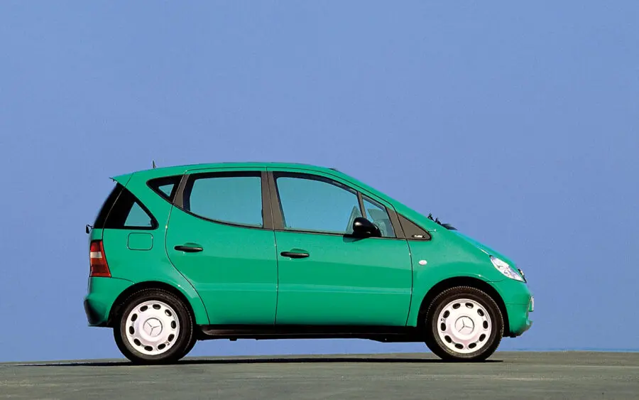
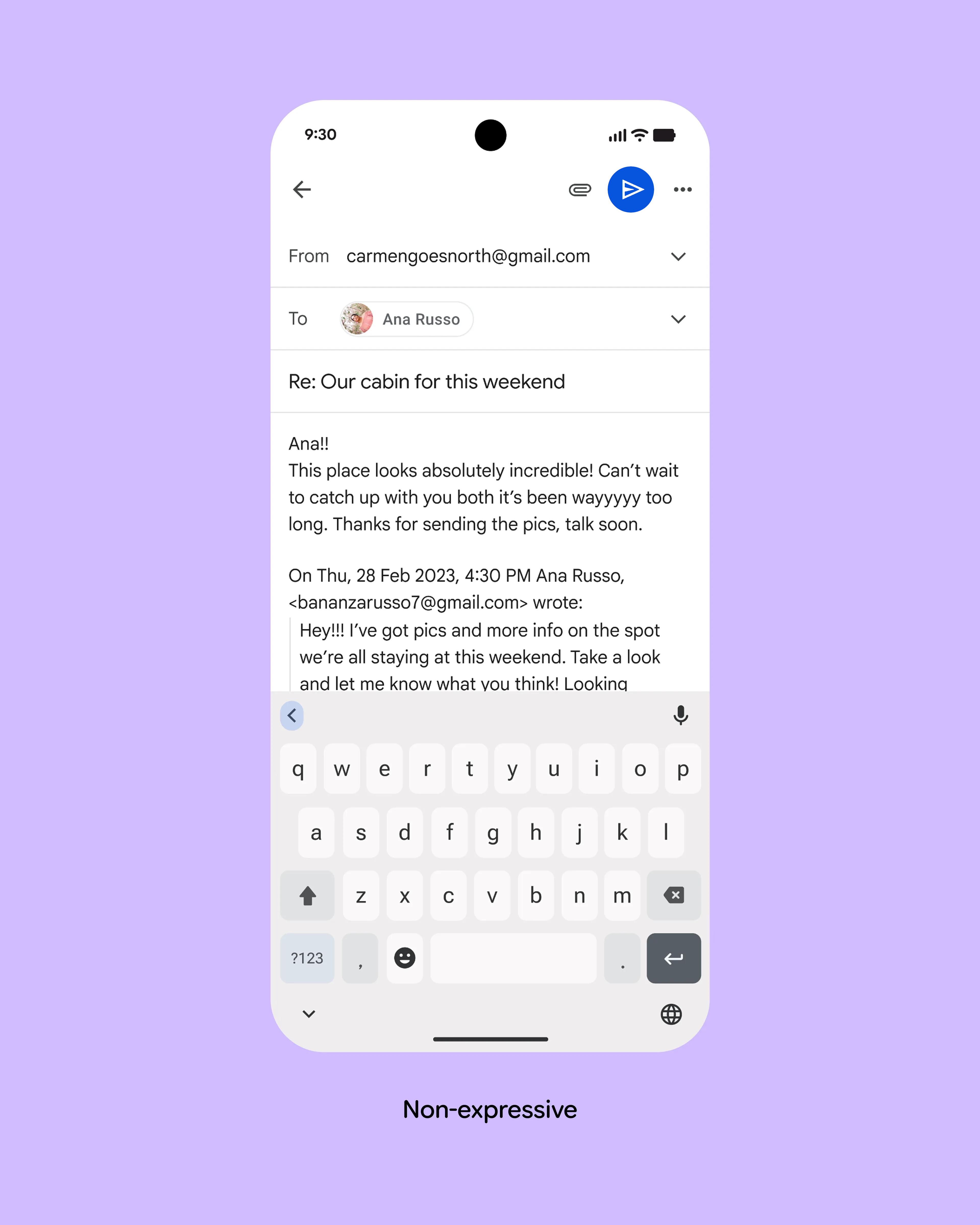