For anyone not familiar with previous designs, each component in https://m3.material.io/components has a "comparison with Material v2" section.
Biggest change seems to be that everything is round and purple now. It looks more playful and less professional.
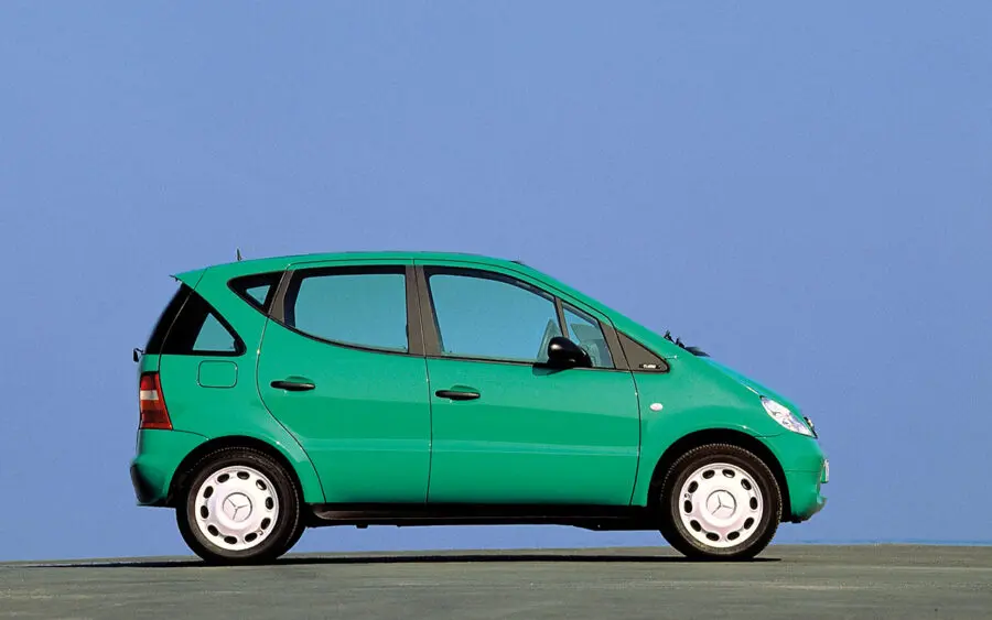
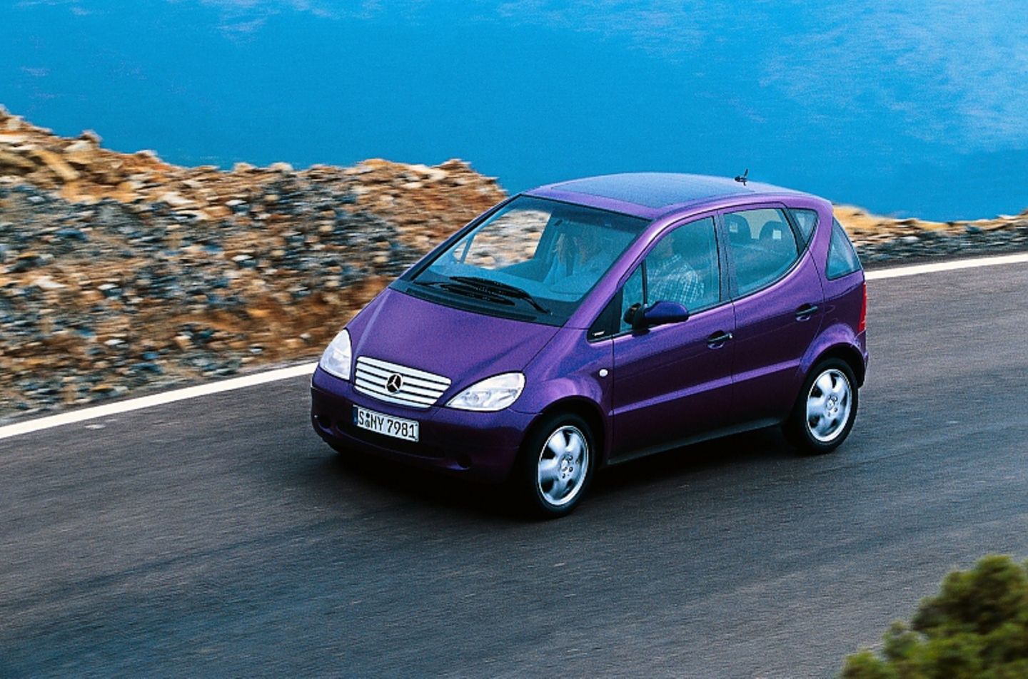
Edit: I dislike their recent color picks. First that teal in Google Maps, now the purple. Why? Are they trying to copy the color paltette of the first Mecedes A-Class (aka "Listerine" colors [1][2])?
[1] https://prestigeandperformancecar.com/wp-content/uploads/A97...
[2] https://image.stern.de/31749130/t/Ag/v2/w1440/r0/-/01--artik...