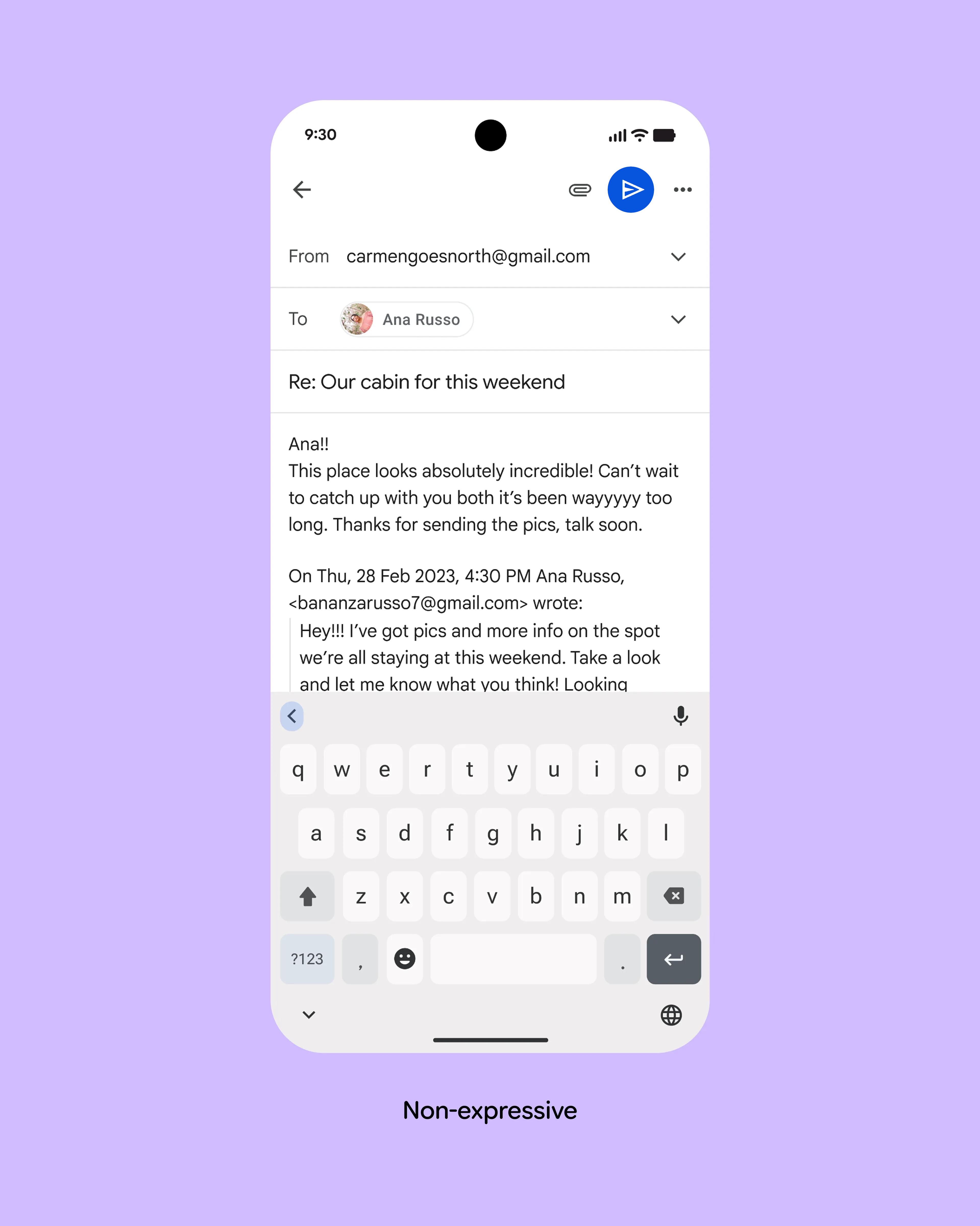
I went through a few thoughts when seeing the design:
- I do have trouble spotting the send button on the old design
- Maybe just moving it to a similar position as the new design would help
- I don't actually want it near the keyboard because I might accidentally tap it
- There's plenty of space, why can't they just have a button that actually says 'send'?
The reason the send button on the old design is hard to see seems to me to be that it doesn't stand out in any way. The only difference to everything else on the screen is that it's blue instead of black, but the contrast isn't big and it's between two less important icons.
Here's a 30-second edit of the first picture that undoubtedly breaks material design guidelines, but also solves the problem without introducing any new problems: https://kappa.lol/7Zuuc8.png
The problem with a text button in a case like this is that the translation of "Send" is longer in most languages and even much longer some languages.
On my Android gmail app, when I reply to an email, there's very little on the screen at the start of the process. The pink-ish send button really stands out since everything else is grey text (I'm using dark mode). They show an image after the user has composed their message and also expanded the quoted previous email text, which is not really what the user's experience is like, so it's misleading IMO.
Maybe just use the word "send" in a blue bubble? Forcing us to discover and translate hieroglyphics is just lazy UI design because you do not want to worry about localization.
my thoughts on the email design: - Comparison is strange. One email has an image, the other text. Not the same email. - Hiding the previous parts of the thread seem good by default, but how do you easily get them back? - Where is "from" in new design? - Where is "to" in new design? - I do like expanding attachment a bit so you don't have to click twice to attach a photo (for example), but I'm not sure how often some of those options are used, may be too much. I could see a photo icon and general attach icon both showing. - Back arrow looks broken in new design.
> Not the same email.
I'm not even sure they're both emails. The first looks like a fairly conventional mobile email app; the second looks like a messaging app.
Not only does it not have a 'from' and 'to' field, it also doesn't have a 'subject' field.
> There's plenty of space, why can't they just have a button that actually says 'send'?
Words? Are you crazy, this is 2025!
/s